ANIMATED FILM & STILLS
2025
Emotive stories of colour, material and finish, driven by consumer insights.
A continuation of our collaboration with WGSN and Coloro, AW 27/28 was the second season of the Key Colours Campaign, developing visual stories for each colour through a series of animation films and still imagery.
The Key Colours campaign turns colour into visually emotive stories that connect to intended consumer responses, supported by research insights within a range of industries.
For this second season, our colour stories had a clear focus on craft, texture and material.
These elements combined with creative worldbuilding allowed each colour's unique qualities to remain at the centre of each film.
Each colour’s story went on a transformation, beginning and ending with altered forms, materials and realities.
‘The future is in the past’
Luminous Blue continues its reign as the 2027 Colour of the Year, as an everlastingly vivid hue that is dynamic, energetic and empowering, while maintaining a vibrant dopamine hit of colour.
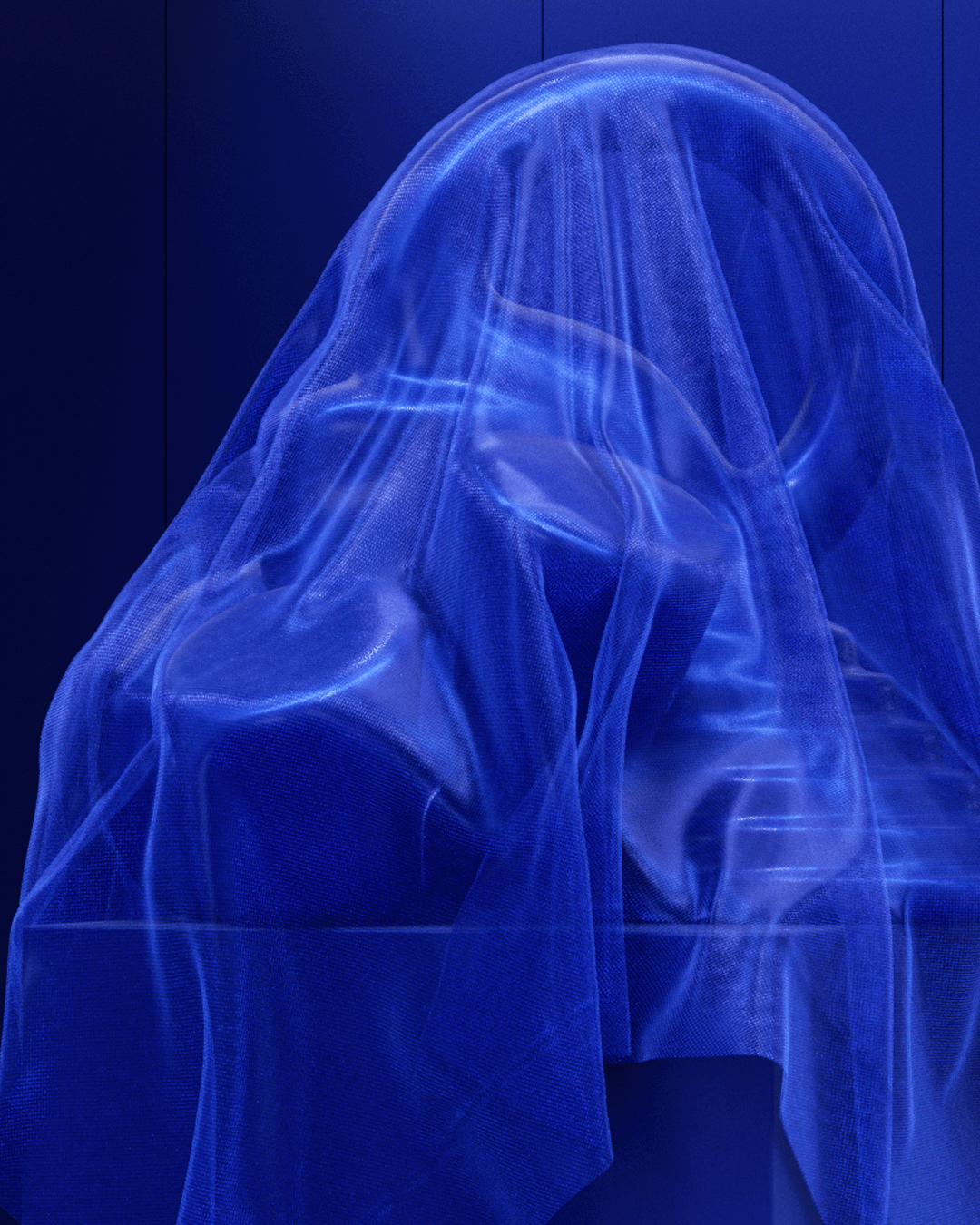

Starting where we left our monolithic sculpture, flowing cloth becomes the new protagonist, representing an invisible hand of craft through the lens of optimism and wisdom.
Layers of digital textiles form a sensually sumptuous character, contorting, folding and flowing.
The material finish and colour deepens, as if being dyed with indigo to usher in this new era.
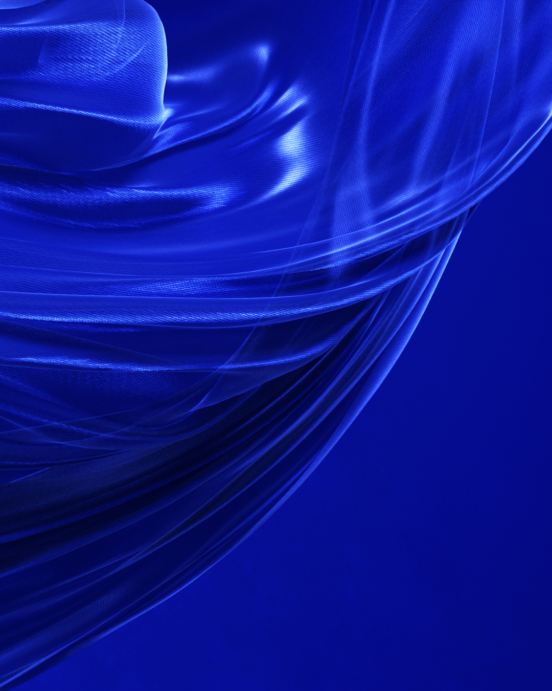
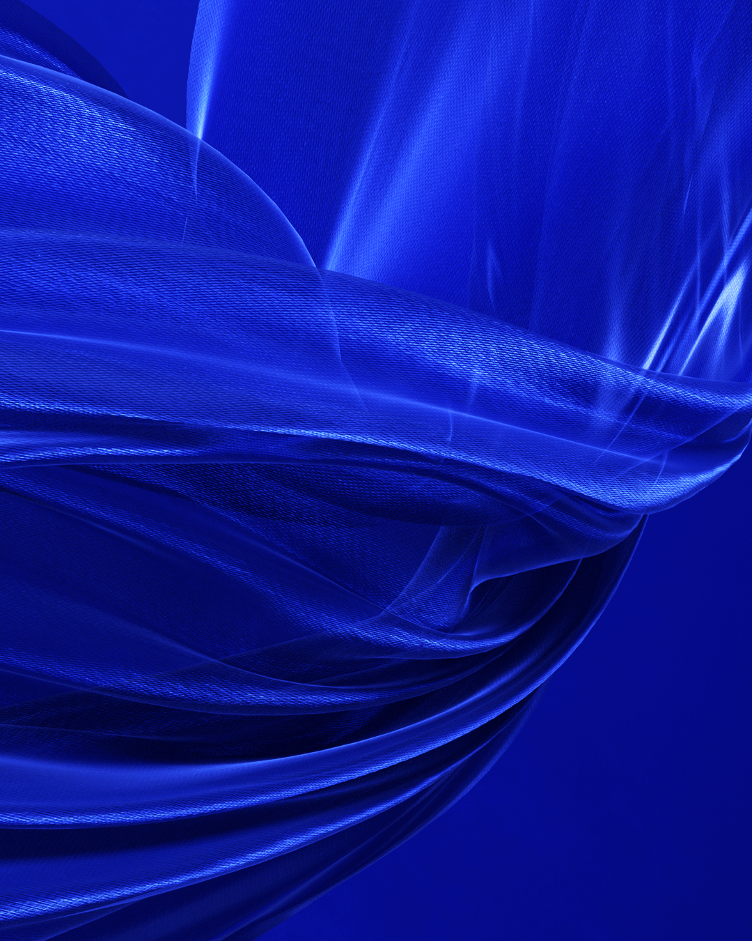

Luminous Blue’s deep colour is drawn from awe-inspiring ancient pigments that feels timelessly futuristic.
Our visual story gives life to this duality of knowledge, from hand craftsmanship to the technological advancements of the near future.
‘Every leaf speaks bliss to me, uttering from the autumn tree’
Russet leads us to a moment of reflection and grounding, through deep earthy tones that feel cozy, familiar and enriching.
The focus isn’t based upon growth or change, but maturing, ripening and nourishing.

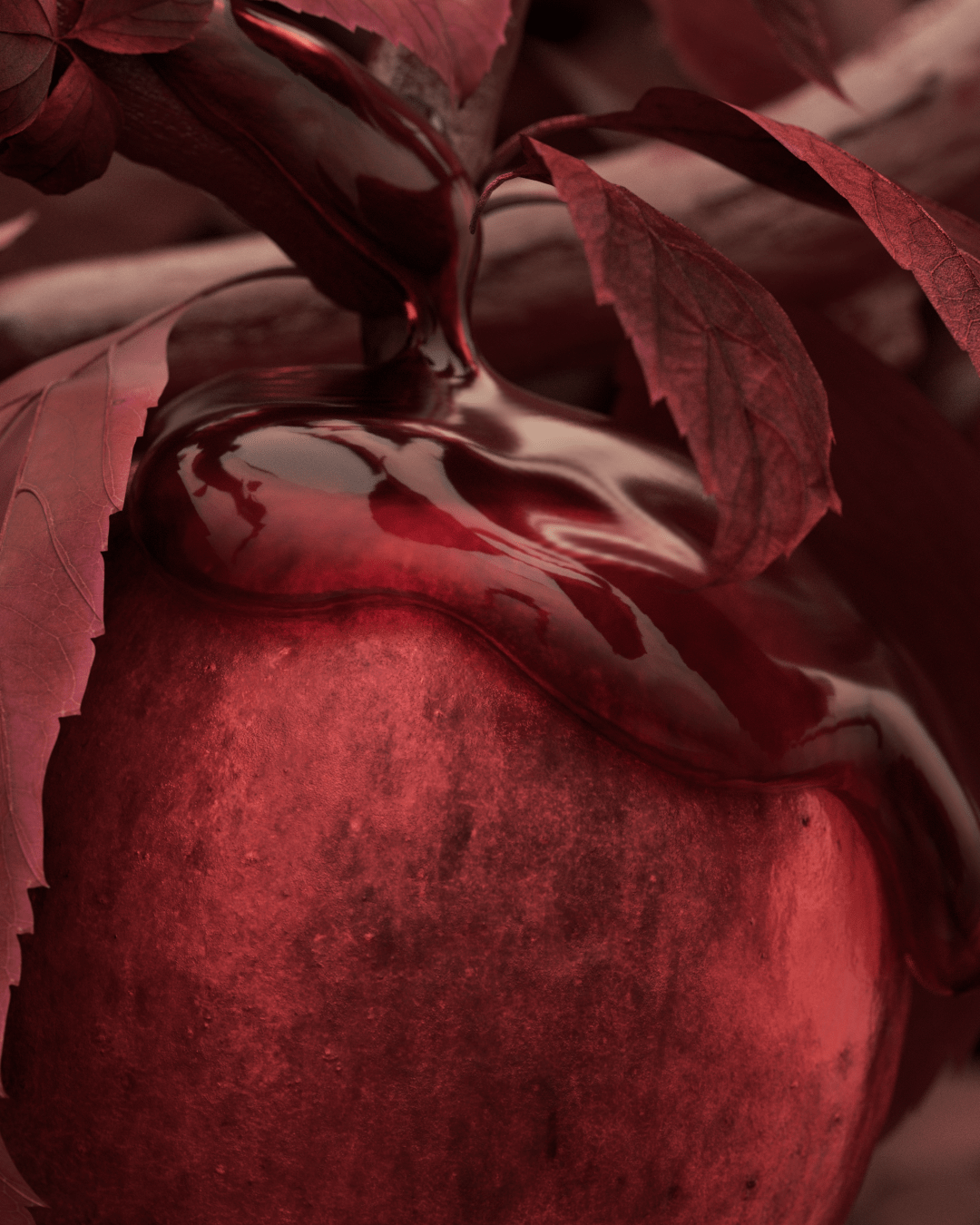

Our protagonist is a russet apple in all its detailed glory, representing new life from decay and the inevitable life cycle.
We observe tree sap travelling towards our fruit, deliciously pouring over the curves with thick viscosity.
Russet embodies a sense of nostalgia and familiarity, a yearning for nourishment during times of change and transition, and ultimately providing a sense of grounding.

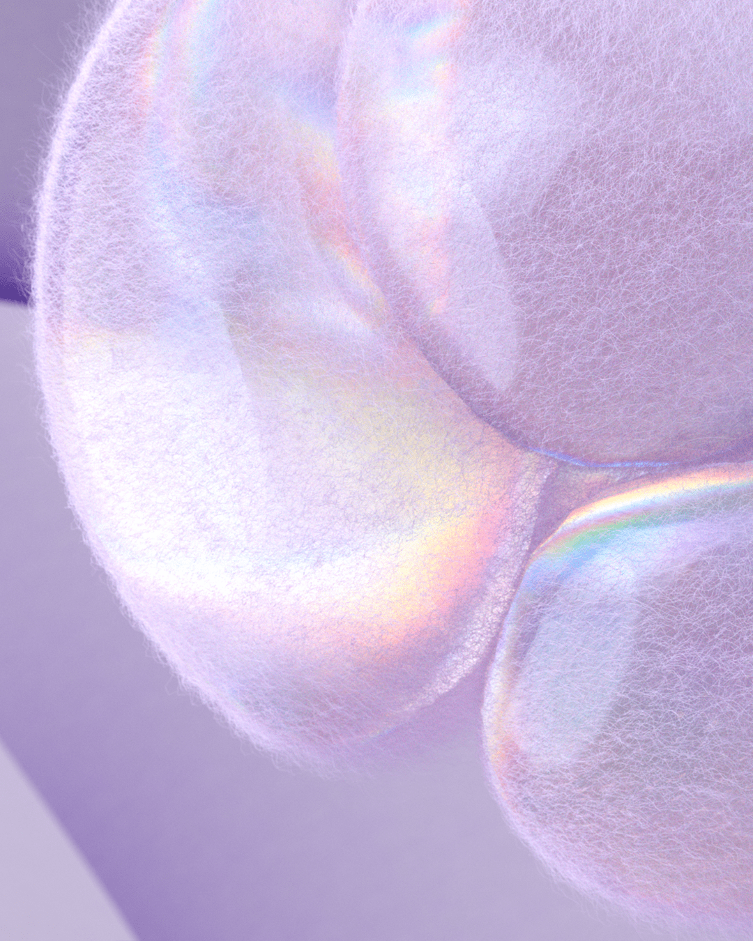
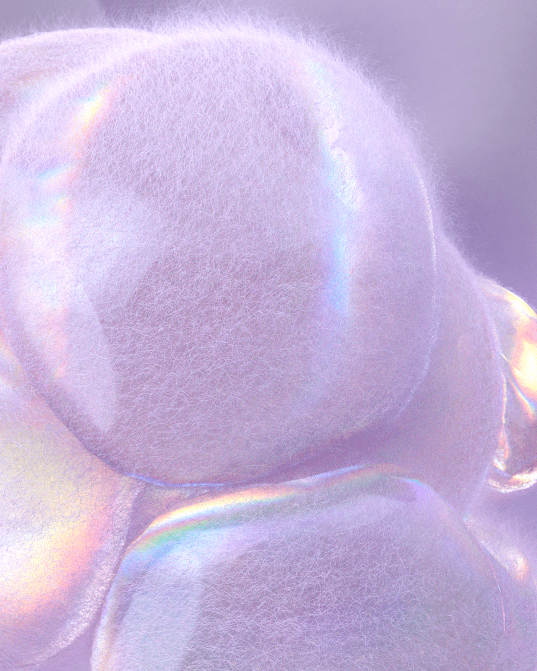
‘Purple, deemed the last colour in the rainbow, is thought of as ‘the end of the known and beginning of the unknown.’’
Peaceful Lilac conjures up a mesmerising combination of enchanting serenity and technological freedom, transporting us to a fantastical space of softness.
Our protagonist is the humble bubble, made up of impossibly delicate textures, existing somewhere between organza, cashmere and candy floss.
The bubble emerges, before inflating and folding in on itself as an otherworldly entity.


The colour itself exudes ethereal iridescence, self-expression and creativity while maintaining a pastel, muted quietness.
Intended for generations whose identity feels permanently online, Peaceful Lilac feels ever evolving with countercultures, providing respite from the outside world.
‘A light wind swept over the corn, and all nature laughed in the sunshine’
Maize is golden in every sense of the word, warm, optimistic and enlightened.
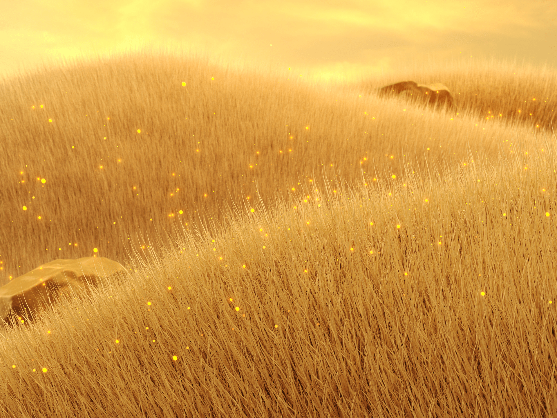
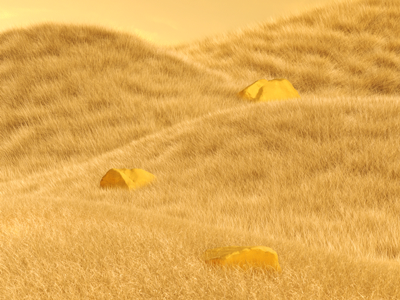

Playing upon Maize’s contrasting qualities of being wholesomely of the earth while insinuating hints of glamour and luxury, our environment begins as rolling hills of yellow-hued grass, swaying in the wind and brushing over scattered golden stones.
Strands of organic matter shimmer in the sunshine, causing lens flares and particles of pollen to drift upwards and grow, as if strands of gold lament are overlapping and becoming something new altogether.
Maize evokes a sense of radiance, reassurance and glimmering hope, as both an earthy and luxurious tone.

‘An emerald shines even if its worth is not spoken of.’
Deep Green summons a moody, mysterious aura, that is equal parts sophisticated as it is edgy.
There is a raw, unrefined wildness to it that emphasises its preciousness and rarity, conjuring up finite materials of the earth such as emeralds, malachite, garnet and marble.
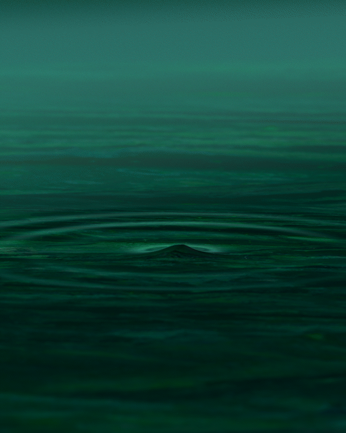
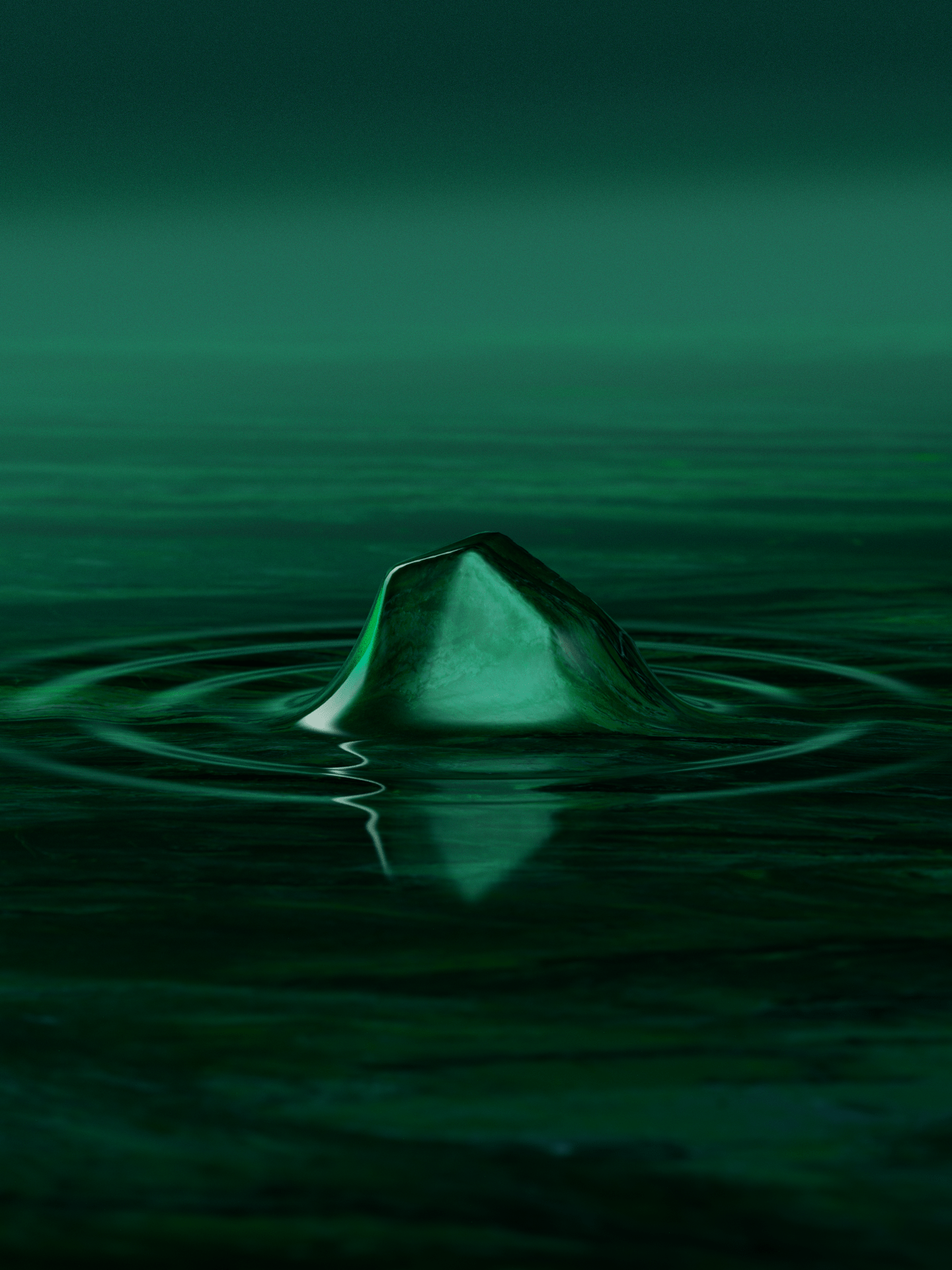
Our protagonist is the Emerald, rich in colour with veins of darkness, seen emerging from the depths of voluminous liquid, in an unpurified state.
Out of the depths other stones appear, as if magnets attracted to one another, rotating and grinding against our green stone to smooth and refine.
Their final composition is a gravity-defying balance, with our beautifully smooth stone as the centre piece.
Deep Green represents empowerment and immersion while retaining an edgy, and wildly haunted quality.

The WGSN x Coloro AW 27/28 Key Colours Campaign went live online in September 2025 with both WGSN and Coloro’s audiences.
-
Direction & Prod.
Lucy Hardcastle Studio
-
3D & Animation
Morbo
-
Sound Design & Edit
Lucy Hardcastle Studio
/
post-template-default single single-post postid-1625 single-format-standard page-state--key-colours-aw-2728
post-template-default single single-post postid-1625 single-format-standard page-state--key-colours-aw-2728